The International Telecommunications Union publishes Recommendation ITU-R BT.709 which specifies how image data is coded for transmission as video. This includes a specification for the representation of color which applies to almost all modern video transmission including broadcast, cable/satellite, or over the internet (but not including emerging practices for high dynamic range/wide color gamut).
We conventionally understand any color to be a combination of red, green, and blue primaries, but the photoreceptors in the human eye do not function on the basis of these primaries, and BT.709 does not include the first principles needed to understand color representation. It only offers the following specification:
| item | parameter | system value | |
|---|---|---|---|
| 1.3 | Chromaticity coordinates (CIE, 1931) Primary – Red (R) – Green (G) – Blue (B) |
x | y |
| 0.640 0.300 0.150 |
0.330 0.600 0.060 |
||
| 1.4 | Assumed chromaticity for equal primary signals (Reference white) |
D65 | |
| x | y | ||
| 0.3127 | 0.3290 | ||
In this post, we take a deeper look at Publication No. 15 of the Commission Internationale de l’Eclairage, CIE 15:2004, which includes the 1931 chromaticity specification, still the defacto standard for quantifying color in a camera and display device-invariant way.
how we see color
For middle to high levels of illumination, the human eye employs three types of cone cells to capture image information projected onto the retina. Each type of cone cell is a photoreceptor that is sensitive to a range of wavelengths of light; the visible spectrum is defined as the overall range of all three types of cone cells.
You can think of each photoreceptor type as having its own wavelength sensitivity profile. In the CIE 1931 colorimetry report, these sensitivity profiles are represented by the color matching functions shown in the following figure.
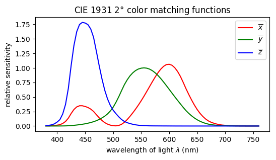
The color matching functions provide a weighting to integrate the spectral power distribution of some light source to result in 3 scalar values that represent how we perceive color. For example, the spectral power distribution of the standard D65 illuminant looks like this,

This spectrum is meant to approximate outdoor daylight at mid-day in Western Europe, correlated to the spectral power distribution of blackbody radiation at a temperature of 6500 K
A human would perceive this light as one color and the CIE XYZ Tristimulus for that color would be computed as:

The two main points from this formulation are:
- X, Y, Z are relative values and we perceive color as the ratios of these values. In terms of specifying chromaticity, there are only two degrees of freedom.
- Any spectral power distribution that results in the same X, Y, Z values is perceived as the same color. You could replace the broad spectrum D65 light source with three narrow-band light sources and get the same color as far as a human observer can tell.
the CIE 1931 chromaticity diagram
The CIE 1931 color space chromaticity diagram, shown below, represents all of the visible colors. It is a two dimensional chart because the human visual system perceives color as the relative differences between each of the tristimulus values.
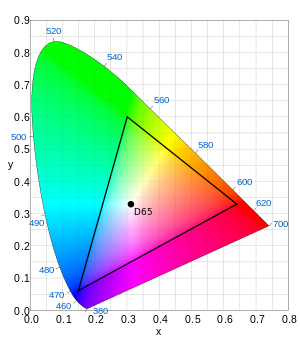
CIE 1931 chromaticity diagram with overlay showing ITU-R BT.709 reference white and color primaries
The axes of the diagram show two of the three tristimulus values that have been normalized to make their sum equal to 1. Mathematically,

The result of normalizing the tristimulus values is that every color is uniquely specified by x and y. You don’t need to also specify z because z = 1 – x – y.
The CIE 1931 chromaticity diagram shows all possible colors obtained by from applying the CIE 1931 2º color matching functions to the set of all possible spectral power distributions. If you could make a narrowband light source at a particular wavelength, say λ = 520 nm, then that color would be at the top edge of the colored region in the diagram. The perimeter is the locus of all narrowband wavelengths.
If you actually compute the X, Y, Z tristimulus values for the D65 illuminant as described above, and normalize the result to obtain x and y, the result is
x = 0.313
y = 0.329
which are exactly the reference white values from Recommendation ITU-R BT.709. The D65 white point is also shown in the chromaticity diagram above. You can see these calculations on this notebook page.
The color primary values from Rec. 709 are shown in the chromaticity diagram as the three vertices of the black triangle. These values are chosen directly, not computed from a spectral power distribution. In fact the specific values are the result of a committee negotiation that combined aspects of earlier standards published in the United States and Europe. The gamut of colors that can be generated from those three primaries is contained within the triangle.
It takes four values to fully specify a colorspace using points on the chromaticity diagram. You need the x,y coordinates for three primary colors such as red, green, blue. And the reference white x,y position is needed to uniquely determine the relative weighting of the three primaries to use when the red, green, and blue values are equal e.g. RGB = (255, 255, 255).
You might look at the chromaticity diagram and say that the roughly 2/3 of the full XYZ gamut of visible colors that is not within the Rec. 709 primaries is not important. You can draw a line from any point on the triangle to some point on the XYZ colorspace perimeter and traverse just one single color along its path. But this exercise is simply showing that the display device on which you are seeing the chromaticity diagram is itself not capable of rendering colors outside of the triangle. In fact, the sRGB colorspace used by your computer monitor uses the same RGB primaries and reference white as Rec. 709. Your eyes can see more colors than your computer monitor can show you.
conclusion
The human eye sees color with three types of cone cells, each of which responds to a different wavelength range of light. The three responses, called a tristimulus, are perceived as one color. You can laboriously compute the tristimulus response for any spectral power distribution to know its color in the full XYZ colorspace. A main objective of color science is to represent color based on chosen color primaries and reference white. This greatly simplifies all operations having to do with color because it replaces the integration of color matching functions with multiplication and addition involving the intensities of primary colors. But the simpler operations come at a price: the gamut of colors that can be represented using color primaries is reduced from the full XYZ colorspace that humans can see. The CIE 1931 chromaticity diagram is used to show the fraction of all colors that can be represented by a given color primary standard, such as ITU-R BT.709.
References
International Commission on Illumination, CIE 15: Technical Report: Colorimetry, 3rd edition. CIE 15:2004. 72p
Notebook page with charts and calculations based on CIE 15: Technical Report: Colorimetry, 3rd edition
Poynton, Charles, Digital Video and HD, Algorithms and Interfaces, 2nd edition. Morgan Kaufman, 2012. pp. 265-285.
“Rec. 709.” Wikipedia, Wikimedia Foundation, 18 Nov. 2017, https://en.wikipedia.org/wiki/Rec._709.
Chromaticity diagram attribution: By CIExy1931.svg: Sakurambo derivative work: GrandDrake (CIExy1931.svg)
